1
2
3
4
5
6
7
8
9
10
11
12
13
14
15
16
17
18
19
20
21
22
23
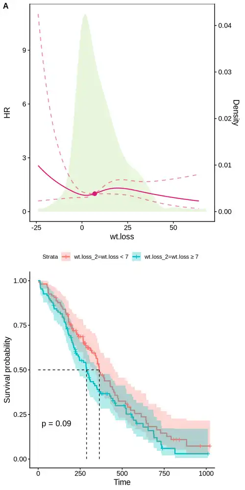
| hr_df <- hr_full %>% as.data.frame
g3 <- ggplot() + cowplot::theme_cowplot() +
geom_density(data = df,
aes(x = wt.loss, y = after_stat(density) * coeff),
fill = RColorBrewer::brewer.pal(8, 'Paired')[3], color = NA, alpha = 0.3, inherit.aes = FALSE) +
geom_line(data = hr_df,
aes(x = wt.loss, y = yhat),
linetype="solid", color="#dd1c77", linewidth =0.8) +
geom_line(data = hr_df,
aes(x = wt.loss, y = upper),
linetype="dashed", color="#dd1c77", linewidth =0.8, alpha=0.5) +
geom_line(data = hr_df,
aes(x = wt.loss, y = lower),
linetype="dashed", color="#dd1c77", linewidth =0.8, alpha=0.5) +
geom_point(data = hr_df[min_hr,],
aes(x = wt.loss, y = yhat),
color = "#dd1c77", size = 3) +
scale_y_continuous(
name = "HR",
sec.axis = sec_axis(~ . / coeff, name = "Density")
) +
labs(x = "wt.loss") + theme(legend.position = c(0.8, 0.9), panel.border = element_rect(colour = "black", fill = NA, size = 0.5))
g3
|